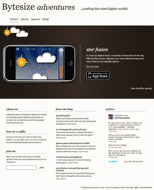
 Lets face it, the previous design for Bytesize Adventures was pretty ugly. More than that, whilst it served its purpose, it lacked direction and cohesion.
As we entered 2010, and with a third iPhone game in development, I decided it was time to do something about the site. What you’re browsing now is my redesign for 2010. What do you think?
I love web design and development and with this latest design I took the opportunity to focus on the details and components that make up the site. Here’s a brief look at some of the key decisions I made for the new design.
Colours
Inspiration for the colour scheme came in the form of Pantone’s announcement of their Spring 2010 fashion colours. Whilst this is perhaps an unlikely source, design inspiration can come from just about anywhere. Pantone’s “Tuscany” captured, in colour, the earthy, crafted, scripture feeling that I wanted from the new site.
I didn’t directly use Tuscany anywhere on my site but it influenced the palette of colours that I did use. From the creamy, textured header and footer to the earthy browns used in the central gradient.
Layout
A good layout was really important for my design. The purpose of Bytesize Adventures is first and foremost to showcase my games and secondly to share my experiences with others. The showcase carousel takes prime spot on the home page, allowing the visitor to easily cycle through my games. As a complement to this I have the “games” menu item in the navigation which takes the visitor to a list of all my games.
I decided to make the footer an integral part of the site design, using it to share information about myself as well as to drive traffic to my blog. Also in the footer is contact information, my twitter feed, and a newsletter signup.
For the blog itself, I opted to drop many of the features that provide, what I consider to be, unnecessary functionality. Instead, the design is focussed on displaying my posts as cleanly and effectively as possible. I hope that this improves the reading experience and as a result the average time spent on the site.
Typography
Well thought out typography has been a growing trend in web design for some years now. We’re now at a point where good typography is expected rather than just being a feature thats nice to have. I’ve really only scratched the very surface of this art with my new design, but what i’ve tried to do is enhance the earthy, crafted feel that I mentioned earlier.
Readability was also extremely important to me. I wanted my blog posts to look nice but not at the expense of readability so I purposely went for a reasonably large 14 pixel sans serif font.
The new Bytesize Adventures design uses 2 very different font families. The primary fonts in each respective family are the serif font “Georgia” and the sans serif font “Helvetica”. A classic combination perhaps, but one that I feel works well in my design.
To keep things interesting i’ve used a variety of font-sizes, italics to emphasise the serif font, dotted and solid underlines, and a heavier weight where necessary. These are subtle touches when viewed on their own but as a whole they work to keep the design interesting.
Conclusion
There are various tweaks that i’ll make in the coming weeks and months but overall I’m happy with the new design. I hope that you find the site a more pleasant experience as a result.


