Welcome to the first devlog for Cardboard Dungeon. In actuality this is really a devlog for experimenting with virtual reality using what I have available to me – Google Cardboard.
I’m anticipating a relatively short project but lets see how it goes. It’s very much going to be an organically developed game, trying things as I go.
What is Cardboard Dungeon?
Cardboard Dungeon is a first-person dungeon crawler for Google Cardboard. I’ts my first virtual reality game and my first 3D game!
At the moment I’m interested in having the experience revolve around exploration – perhaps something to do with cartography.
I’m also keen to play around with both interaction and interface. What can I achieve purely with gaze and single click interaction? How can I manifest all required interface as objects in the virtual world (e.g. a physical compass etc)?
A-frame
The official Google Cardboard SDK works with either the Android development environment or Unity (and iOS and Android by extension). I still have a bit of phobia to development environments such as Unity. It may be that VR will give me the push I need to really get into Unity.
For now, and for the purposes of this project, I wanted to try A-Frame (created by Mozilla’s virtual reality research team). A-Frame is framework for creating web-based VR experiences.
So far, the experience of developing with it has been pretty good. There are a number of examples on the website, a relatively clear and well laid out set of documentation, and a friendly slack channel (frequented by the A-Frame developers).
I’m still learning the in-and-outs of the framework. It relies heavily on HTML markup and I’m currently finding the balance between that and Javascript.
Streaming levels
One of the first challenges I tackled, for the start of this project, was the presentation of levels. I knew I couldn’t render the whole level at once so I needed a way to define a renderable area.
My current implementation consists of a 3×3 grid of entities representing N, NE, E, SE, S, SW, W, NW and a central entity. Additionally I’ve added 4 extra entities at NN, EE, SS, WW – these are to extend the players visibility in these directions as the 3×3 grid was too limiting.
I’m using JSON to define the room data. This consists of x,y coordinates beginning at 0,0 and extending both negatively and positively. This represents the room position from a top-down perspective. I then define which walls, ceilings, and floors to draw, per room, using zeroes and ones.
It’s in this way that I can load the data into the visible entities and then simply change the data in the 3×3 grid as the player wishes to move. The entity positions are static and so is the player camera.
I’m still playing with this solution as A-Frame does have a “visible” component, pointed out to me by one of the developers. It may be that I could create the markup of the whole level first and then just add/remove the visible component. Or indeed some other combination of the two solutions.

The Compass
I knew I wanted a compass in the game as soon as I started to walk around the dungeon. Even with the relatively small size of this test dungeon, its easy to get lost. It was also an opportunity to create a piece of interface as a 3D object in the game.
This was relatively easy to achieve by assigning the “look-controls” component to a box primitive representing the compass casing. This will turn with the camera. The needle is then a fixed primitive pointing north. It never moves, its just the casing that rotates. A pretty simple solution.

Lighting
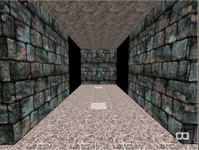
The issue with the 3×3 grid of rendered rooms is that you can clearly see the missing planes for rooms that aren’t being rendered at the edges of the grid. You can see this in the image below…

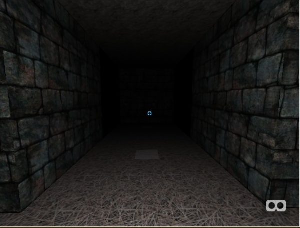
The solution to this is two-fold. Extending the the number of rendered rooms directly north, east, south, and west of the player helps to lessen the effect. Additionally, adding a point light to the players location places the distant rooms in shadow. This obscures the room rendering such that you are unable to see the missing planes. See the image below…

That’s all for this first devlog. Feel free to check out the current development version here (You’ll need a reasonable powerful mobile phone and, ideally, a Google Cardboard headset). I’ll have another devlog, with more progress, soon.